
Coca-Cola Tests Out a New Unified Look for Cans
Streamlining one of America's most iconic brands
 Credit:

Recommendations are independently chosen by Reviewed's editors. Purchases made through the links below may earn us and our publishing partners a commission.
Coca-Cola has proven its marketing mastery time and time again. The specially contoured bottle, vibrant red coloring, and smooth curving font are all staples of the iconic soft drink.
But the job of marketing is never done. Now, the beverage giant is looking to the future, planning to roll out two new brand unification campaigns over the coming year.
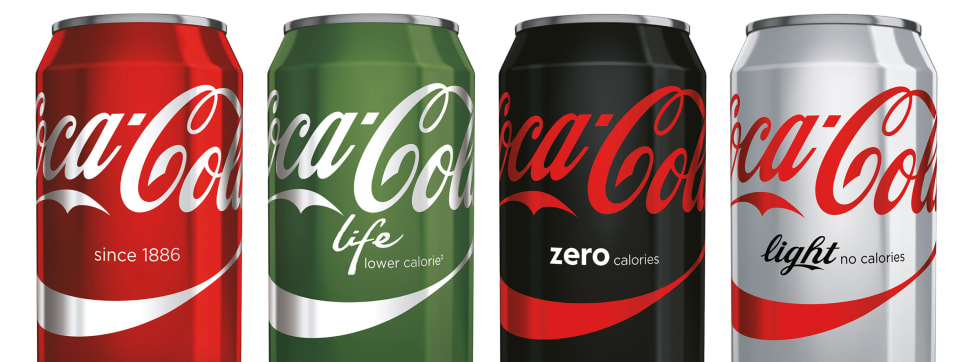
Today, each of Coke's core products has a slightly different brand identity: Classic Coca-Cola is red, Diet is silvery grey, Coke Zero is black, and new Coke Life is green. Some cans also use fonts or word placement that differs from the original design. But that's about to change.
Monocolor uses matching font and overall layout while retaining unique can coloration.
In 12 different countries, a new Monocolor look is set to hit retailers. With this scheme, the various Coca-Cola formulations will keep their unique colors, but use the same label layout, Spencerian script, and classic swoosh.
Spain, however, is getting a treatment all its own, known as the "Split." In this styling, the top two thirds of each can is red and sports the classic Coca-Cola label. The lower third, beneath the swoosh, retains each variety's current color scheme.
The idea here is to reinforce the brand's most identifiable characteristics and draw a clear line between the related products. Coca-Cola itself explains that “with this new approach, whichever Coke you choose, you’ll have the iconic Coca-Cola brand in your hand.”
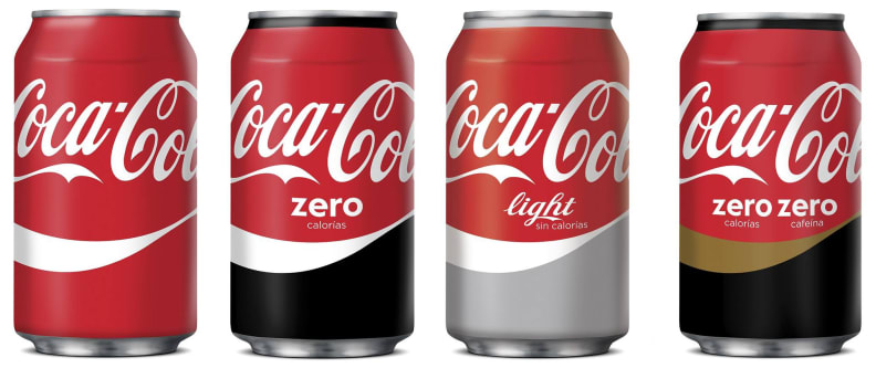
The Split look—currently slated only for Spain—unifies the upper portion of each can to look like Classic Coke while differentiating the bottom section.
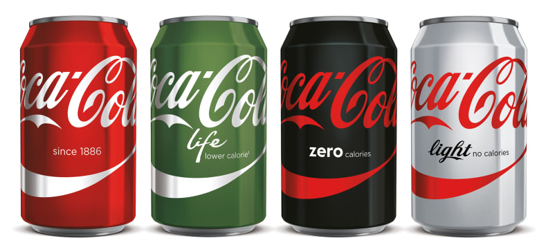
For now, U.S.-market Coca-Cola products are getting a separate, slightly less aggressive revamp. The new cans generally adhere to the Monocolor style, but Diet Coke keeps its modern logo and name. Have a look below, and feel free to share your thoughts on all of the new designs.

The American version of Monocolor is slightly different; note the closer adherence to the current Diet Coke style.
Related Video
{{brightcove '3952655564001'}}